Nancy Cadena
visual designer
Bilingual designer with 8+ years of experience in the ad, entertainment and tech industries. Worked with known brands such as Electronic Arts, PlayStation, Facebook and Oculus.
PORTFOLIO
OVERSIGHT BOARD MOTION STUDIES
OVERVIEW
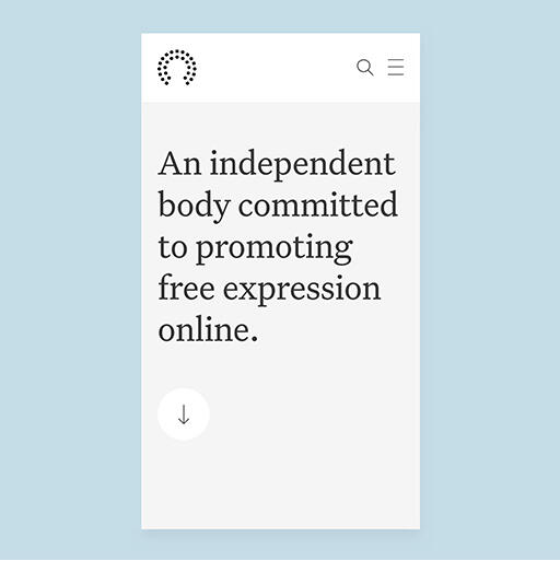
The Oversight Board was created to help Facebook answer some of the most difficult questions around freedom of expression online: what to take down, what to leave up, and why.At Codazen, we developed their public website and accompanying Case Management Tool. This was an extremely ambitious project with a website launching in 10+ languages and a tool with a complex flow.During development, I acted as a bridge between the design agency and our development team. Creating interactive prototypes for stakeholder review, making sure all designs were built to spec, identifying any UX and accessibility concerns and proposing feasible alternatives when needed.One part of the process I enjoyed very much was creating Motion Studies for elements of the public site with direction from the agency. Below are some explorations.
Mobile Menu
The mobile menu explored as:
1. Slide in
2. Fade up
3. Staggered Slide in
Desktop Menu
The desktop menu explored as:
1. Fade and Scale from top
2. Fade and Scale from middle
3. Staggered Slide down
Main Navigation Bar
The original size of the main nav would have blocked a considerable amount of screen real estate for the user. We decided to explore some transitions into a simpler bar while keeping the branding in view.
Misc.
Timeline, shape and arrow animation.
| Skills | Software | Year |
|---|---|---|
| Motion graphics | Keynote | 2019-20 |
| Animation | After Effects | |
| Prototyping |
BEATPEDIA
OVERVIEW
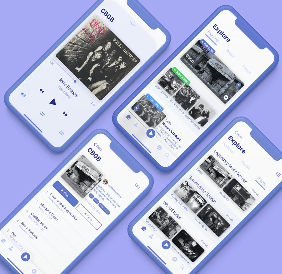
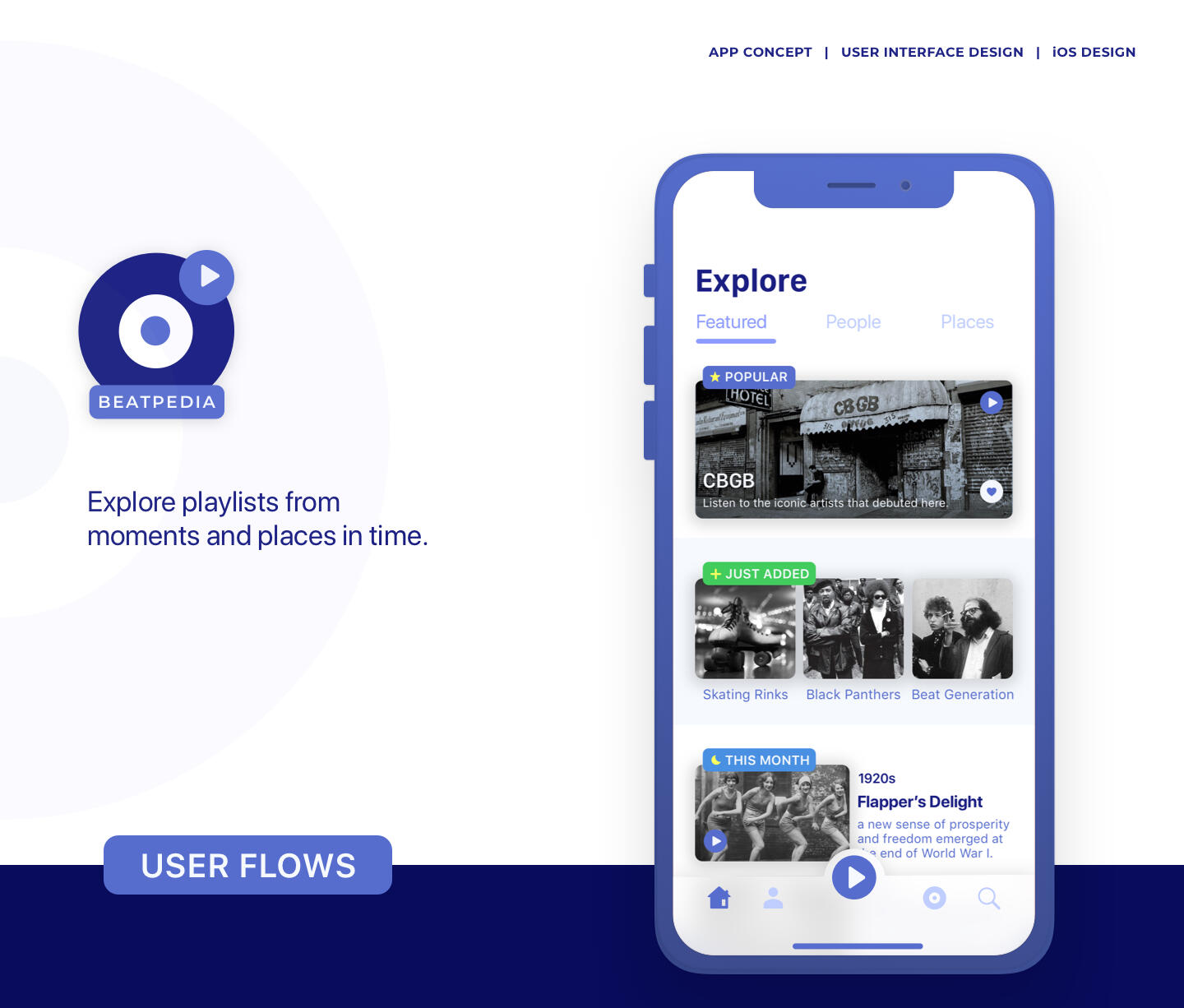
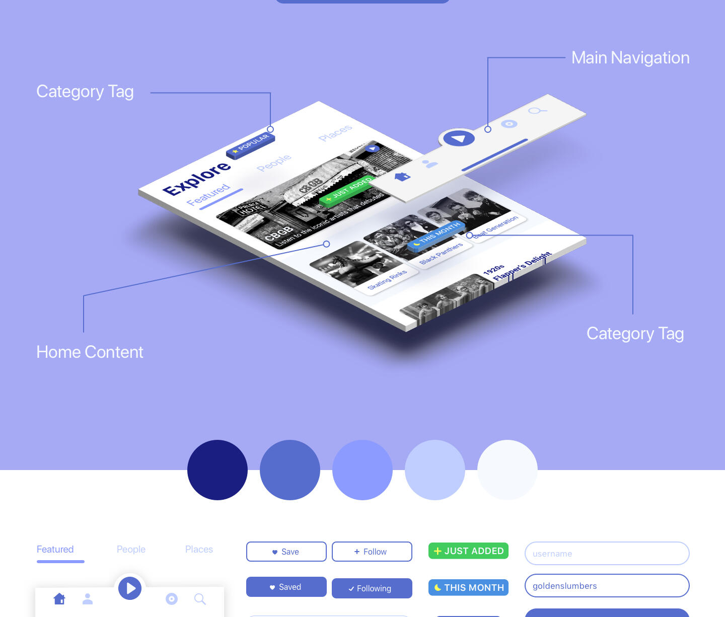
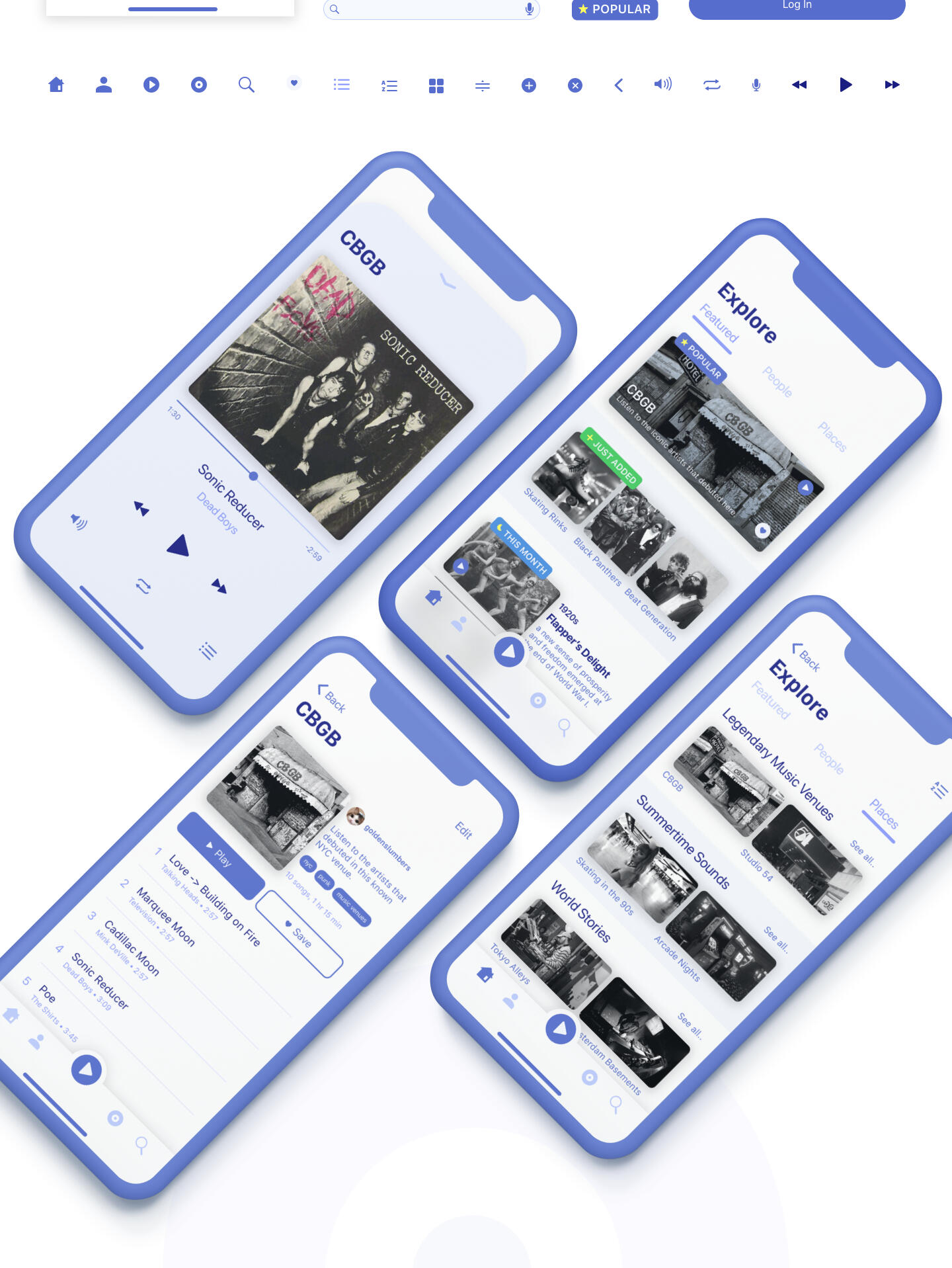
Beatpedia is an app I conceptualized for the CareerFoundry UI Design course. Beatpedia offers an alternative method to searching for music. It combines people, moments and places in history with music playlists created by users. Some example queries:“What music was playing in San Francisco during the Summer of Love?”“What artists did Salvador Dali listen to?”“What music would be playing in a NYC punk club in the 70s?”Think of wikipedia but with playlists instead of articles.
CONTEXT AND RESEARCH
There are many music apps available helping users discover music. Mainly based on new releases, related artists and songs, moods and activities and decades. There is no service I could find that had historic events and people as browsing categories.The most relevant web app I discovered is: Radiooooo.com. This site offers music exploration by country and decade exclusively. Another resource I found were subreddits where users ask these types of questions and users reply with existing songs or playlists from spotify, soundcloud, etc.This app distinguishes itself by being entertaining and educational at the same time with infinite possibilities of exploration and giving the users a special sense of discovery and contribution.
Target USERS
Curious users who listen to music constantly and are looking for an alternative way of finding interesting playlists to enjoy.
MAIN FEATURES
⁃ Discovery page with music suggestions based on historic/current
events, relevant characters
⁃ Search function with relevant filters
⁃ User profile
⁃ Saved playlists
⁃ Music Player
| Skills | Software | Year |
|---|---|---|
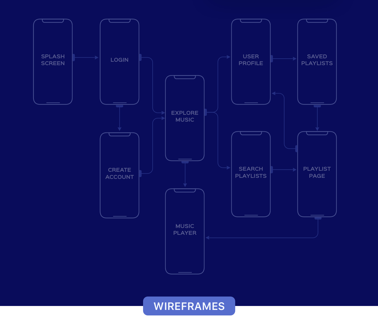
| User Flows | Sketch | 2018 |
| Wireframes | InVision | |
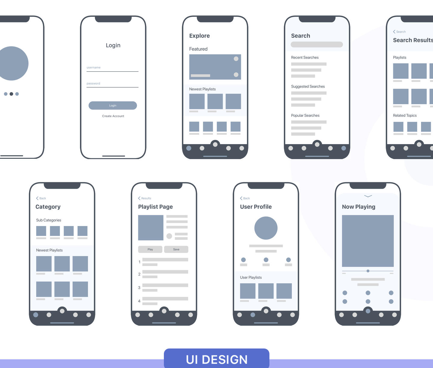
| UI Design | Illustrator | |
| Prototyping | Flinto | |
| Animation |
COOK OFF
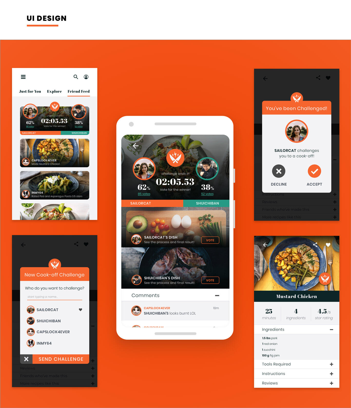
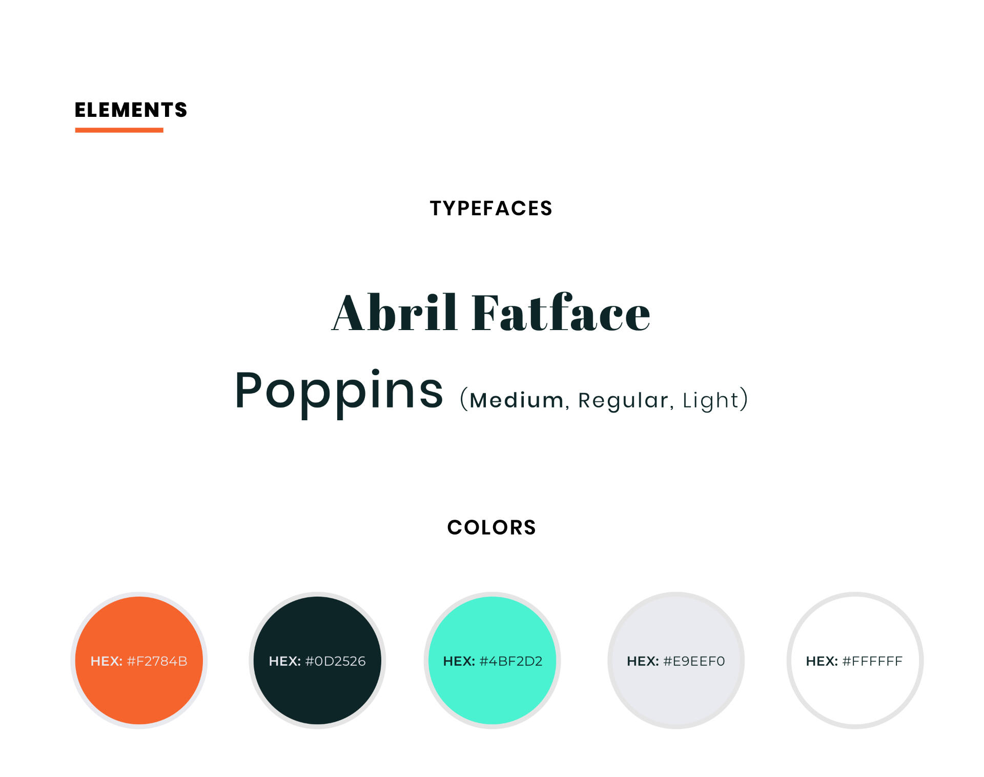
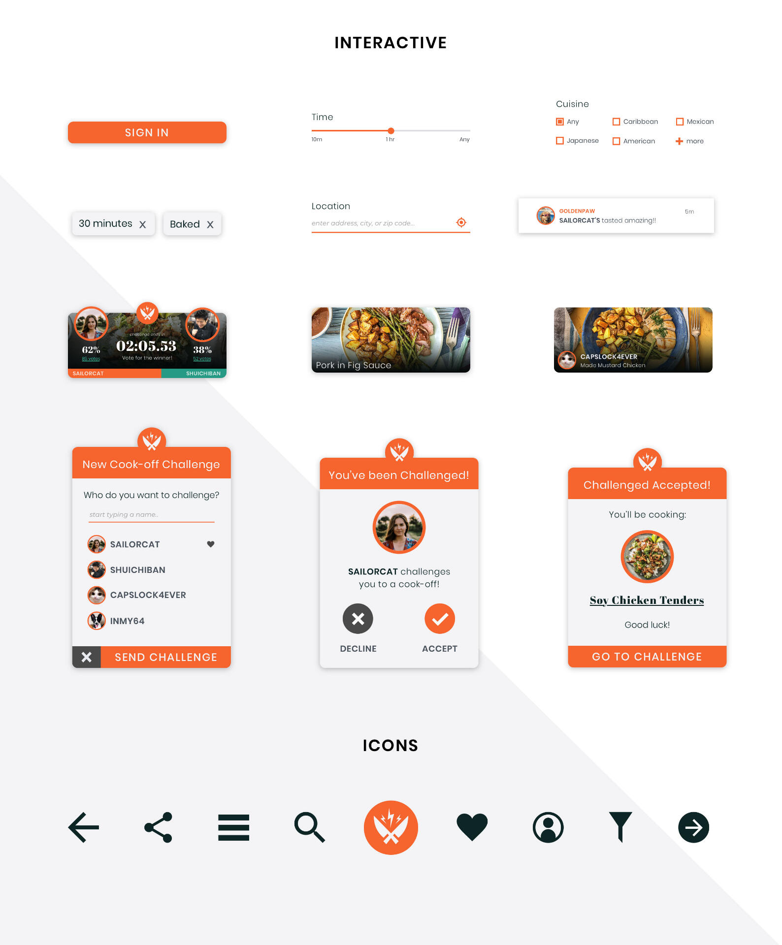
OVERVIEW
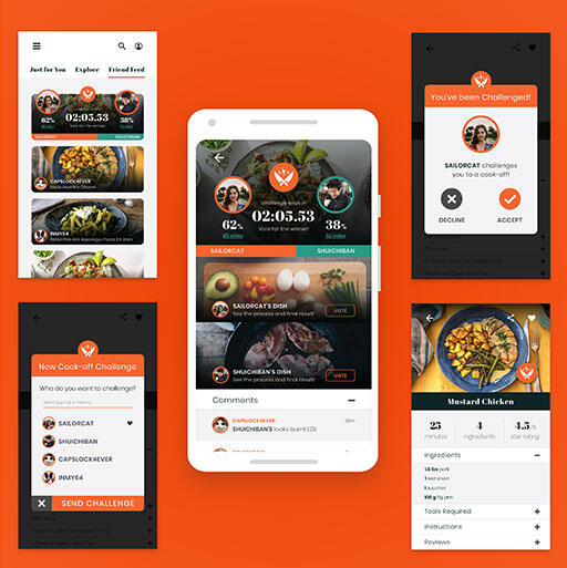
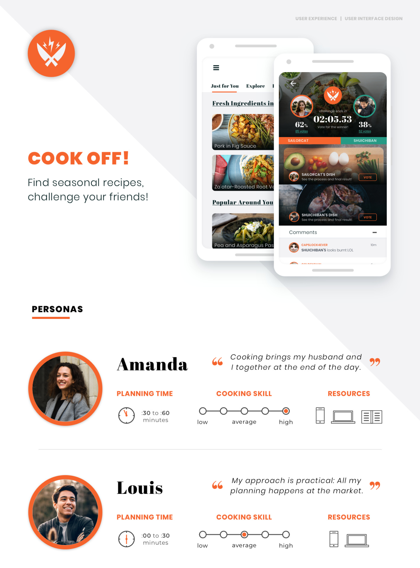
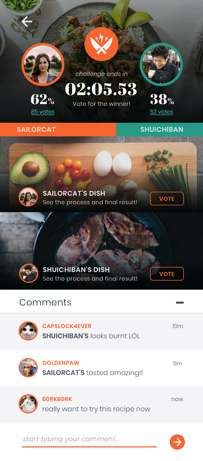
The Cook off App’s main goal is to encourage people to cook more for themselves and others. Main features offered to the user are:
- multiple paths to recipe discovery (including personalized seasonal and location based recommendations)
- a social component which features a friend activity feed
- and the main differentiator which is engaging in cooking challenges between friends.
PURPOSE AND CONTEXT
This project was part of the UI design course curriculum, aiming to explore the User Experience and Design Workflow aspects of building an application.
OBJECTIVE
I chose this type of app because I myself have an interest in cooking, but like many other people, I don’t have one go-to resource for recipes and my motivation varies greatly. I believe the social aspect to any app is a big drive to engage more in certain activities, cooking included.
APPROACH
I started by identifying the problem and generating a hypothesis:
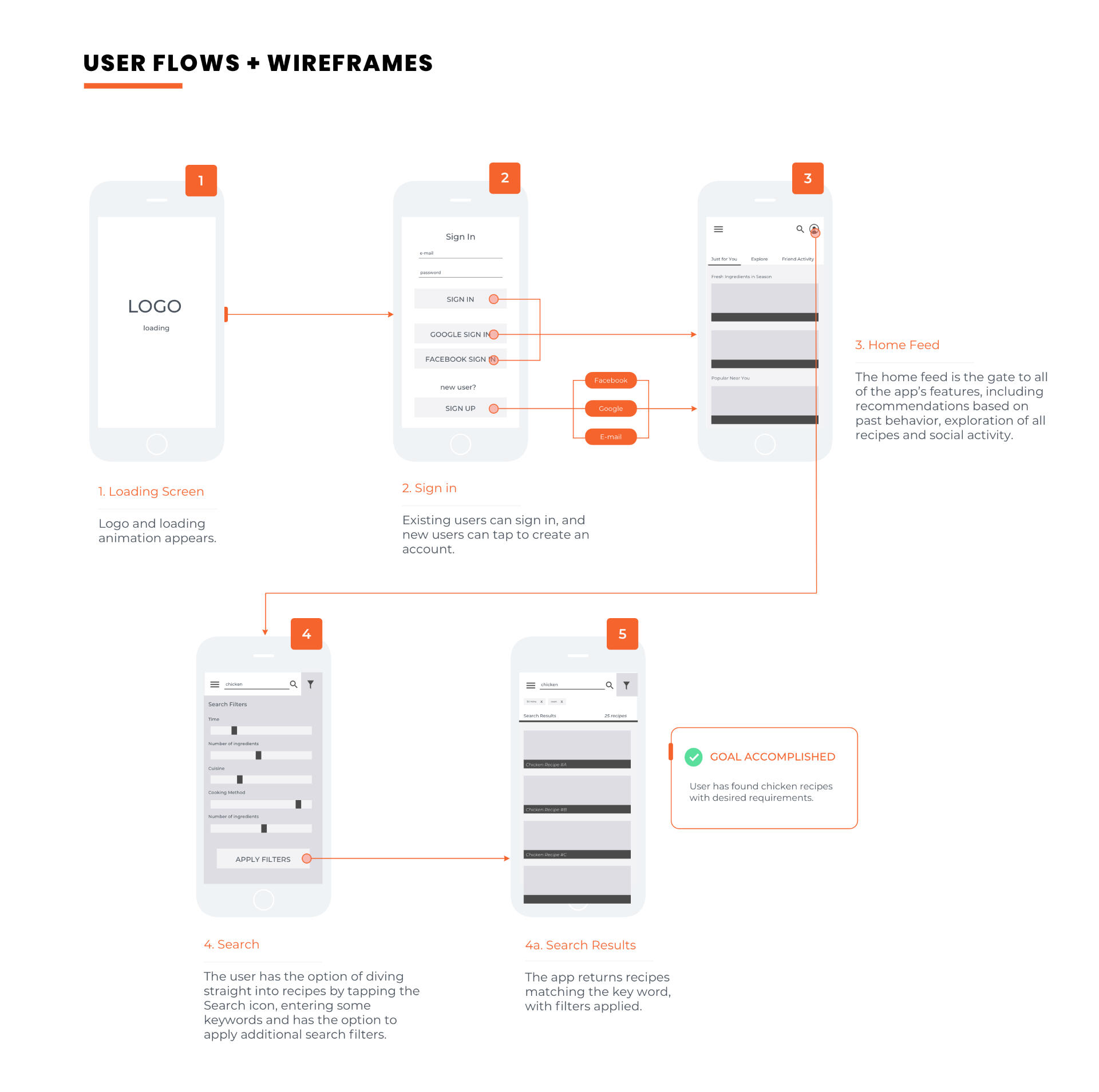
“Planning is the most difficult part of cooking”Many people don’t cook because they don’t have time to research meals, it takes a lot of effort and they miss out on many simple recipes because they just don’t know to search for them. Based on my hypothesis, I created a questionnaire to conduct User Research around it.After obtaining confirmation and new, valuable insights from this research, I created the User Personas that my app would aim to target.With these created, I followed with their User Stories and User Flows to visualize how a user would complete common tasks within the app.
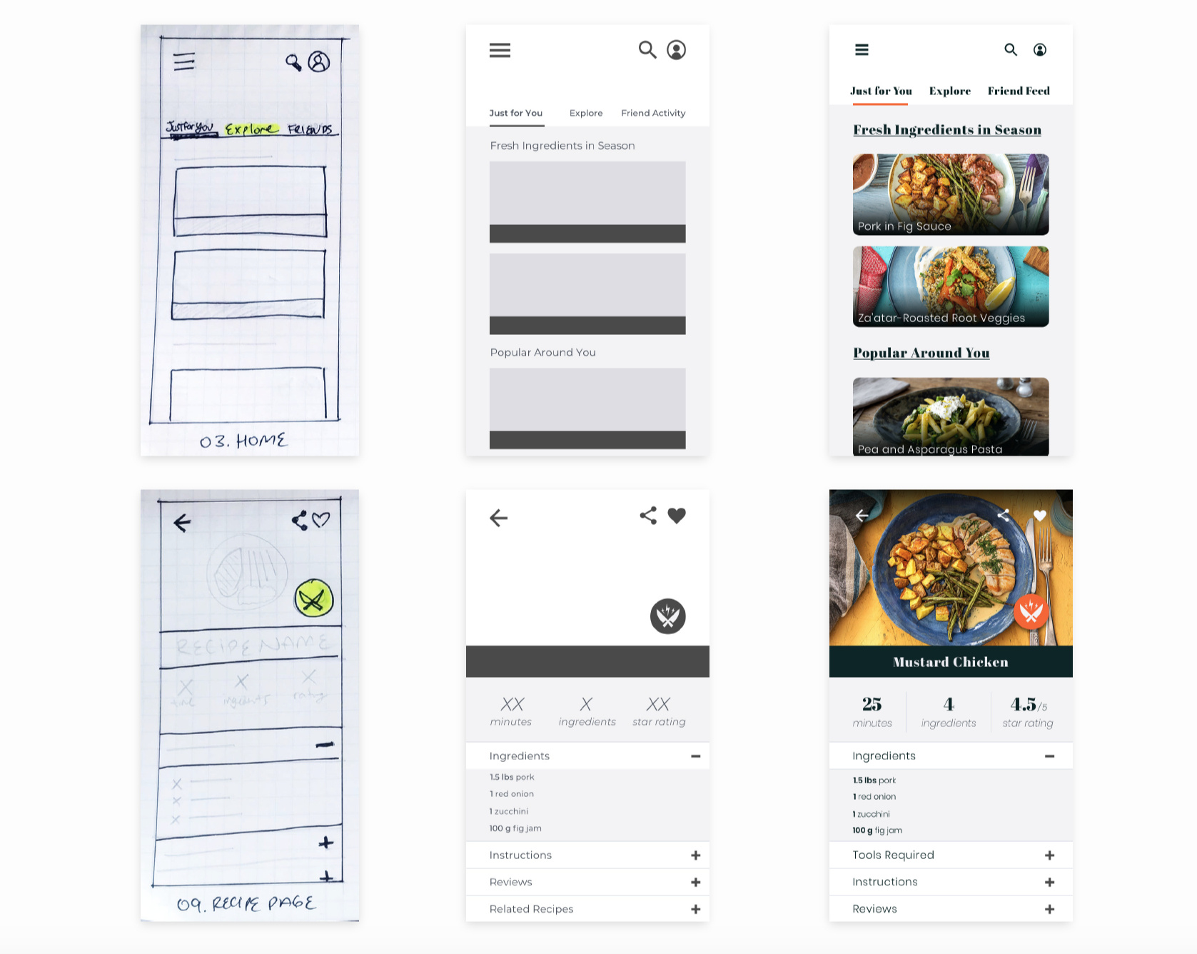
After establishing the main requirements for a Minimum Viable Product, I gathered inspiration and created Mood Boards to choose a design direction.Once the design direction was chosen, I sketched Low Fidelity Wireframes, went on to create Mid-Fidelity Wireframes along with a basic Prototype and tested these on a few of my research participants, gathering feedback and editing as needed. I followed with High-Fidelity Wireframes and finalized the Visual Design, continuing to test these with select users.
CHALLENGES
Overall the hardest part was how to present the challenge page. I don’t have experience designing games, and wanted something very visual, calling the user to interact. I studied simple UI in games and other resources before arriving at the final design.
DURATION
From initial research to final
design, the whole process took
2 months: July to September.
CREDITS
I was the UX and UI designer for this project, gaining feedback and interviewing fellow students and colleagues.
PROTOTYPE
| Skills | Software | Year |
|---|---|---|
| User Interviews | Sketch | 2018 |
| Personas | InVision | |
| User Flows | Illustrator | |
| Wireframes | ||
| UI Design | ||
| Prototyping |
1UP CYCLE
OVERVIEW
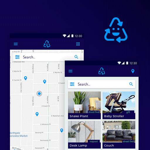
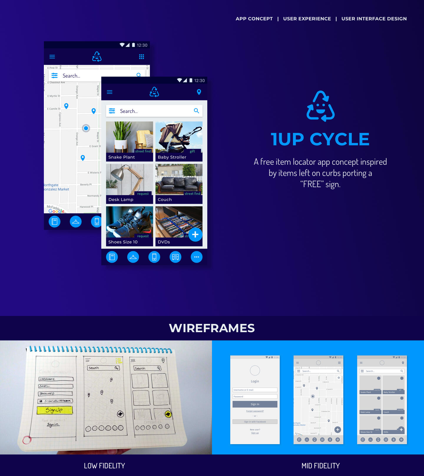
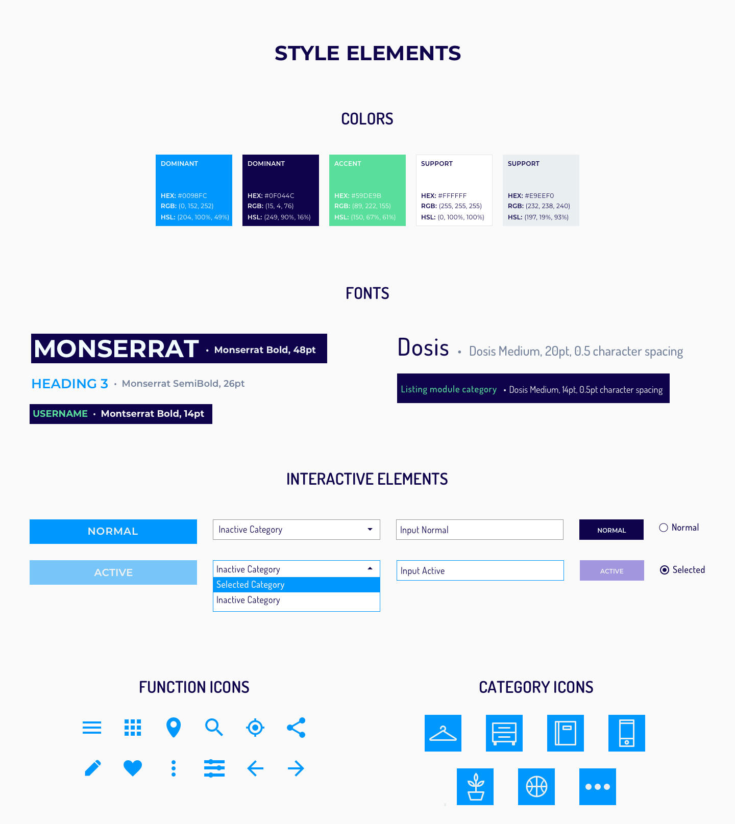
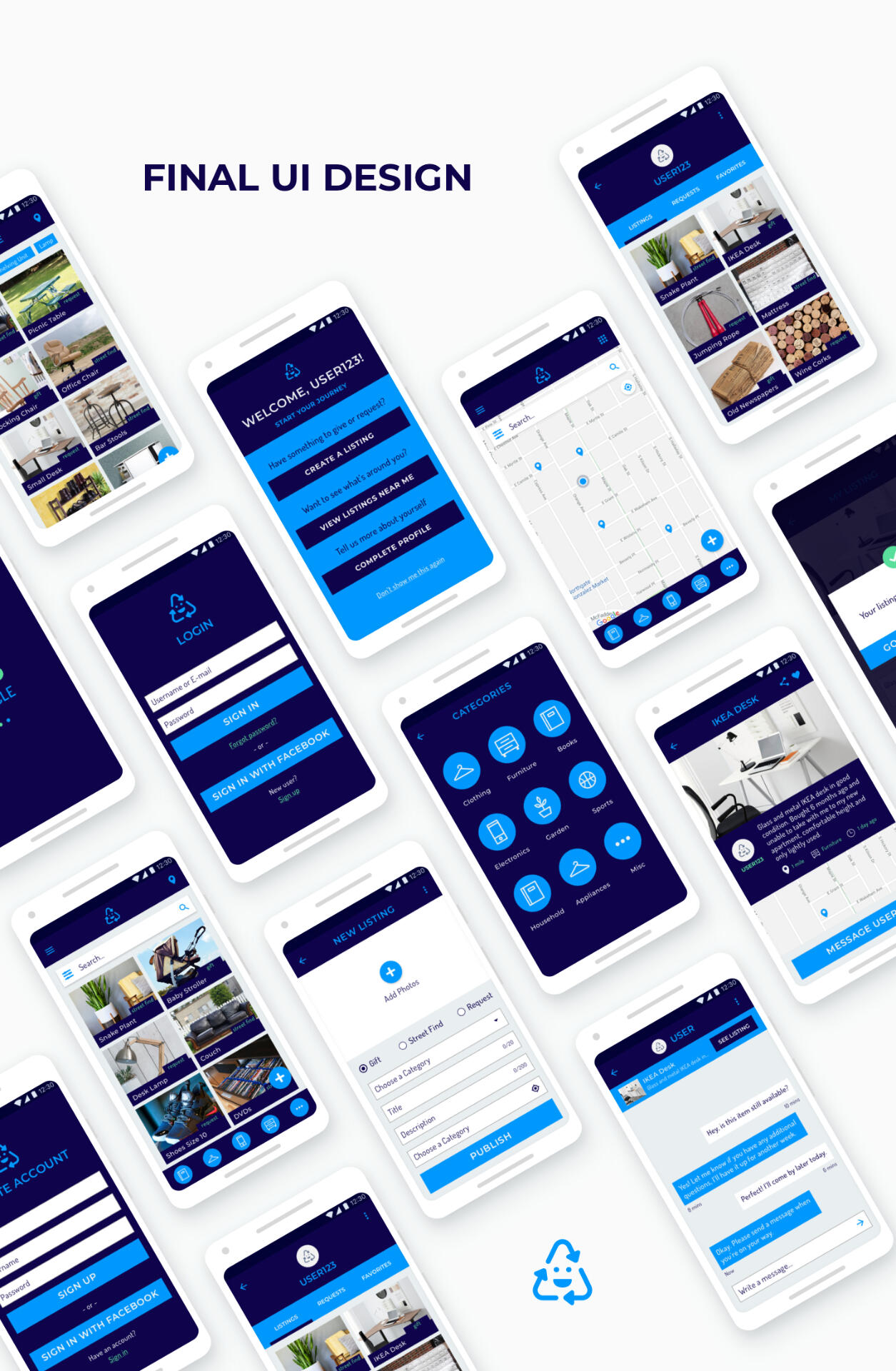
This app concept for the CareerFoundry UI Design Course was inspired by all the tossed items people will normally put outside their home with a “FREE” sign. I thought there should be a better way technology could assist with amplifying the visibility of these items and increasing the chance of extending their use in needy hands. The app exclusively features free items listed by users either in their possession or spotted on the street, along with location and additional information.Utilizing known Android patterns and referencing other marketplace apps, I designed a simple interface where the available items are the main focus. The user has the option of browsing this content based on their location on a map, or to choose a list view.Users can browse by category, see listing pages with descriptions, save listings and message each other with inquiries about items.
| Skills | Software | Year |
|---|---|---|
| Wireframing | Sketch | 2018 |
| User Flows | InVision | |
| UI Design | Illustrator | |
| Prototyping |
Playstation store
SUMMARY
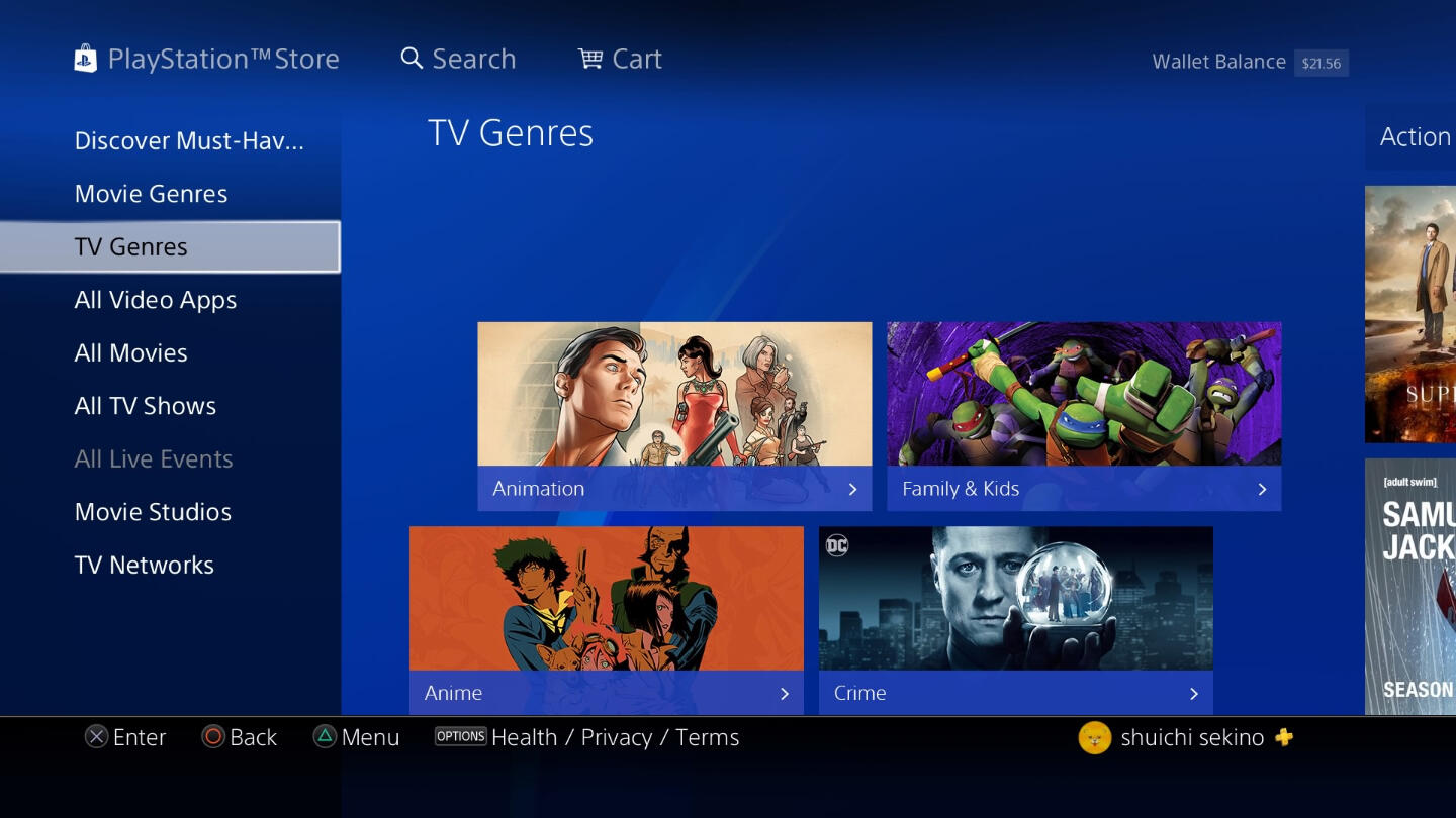
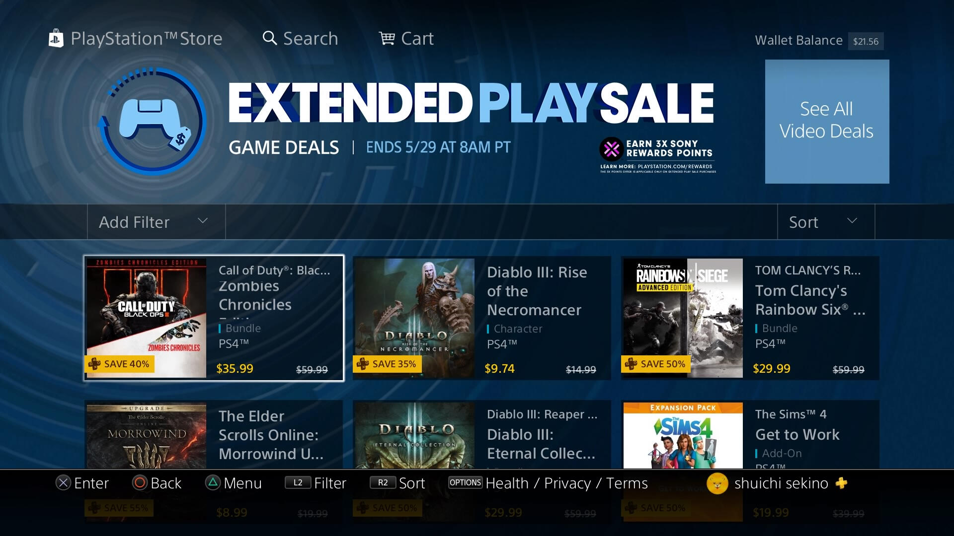
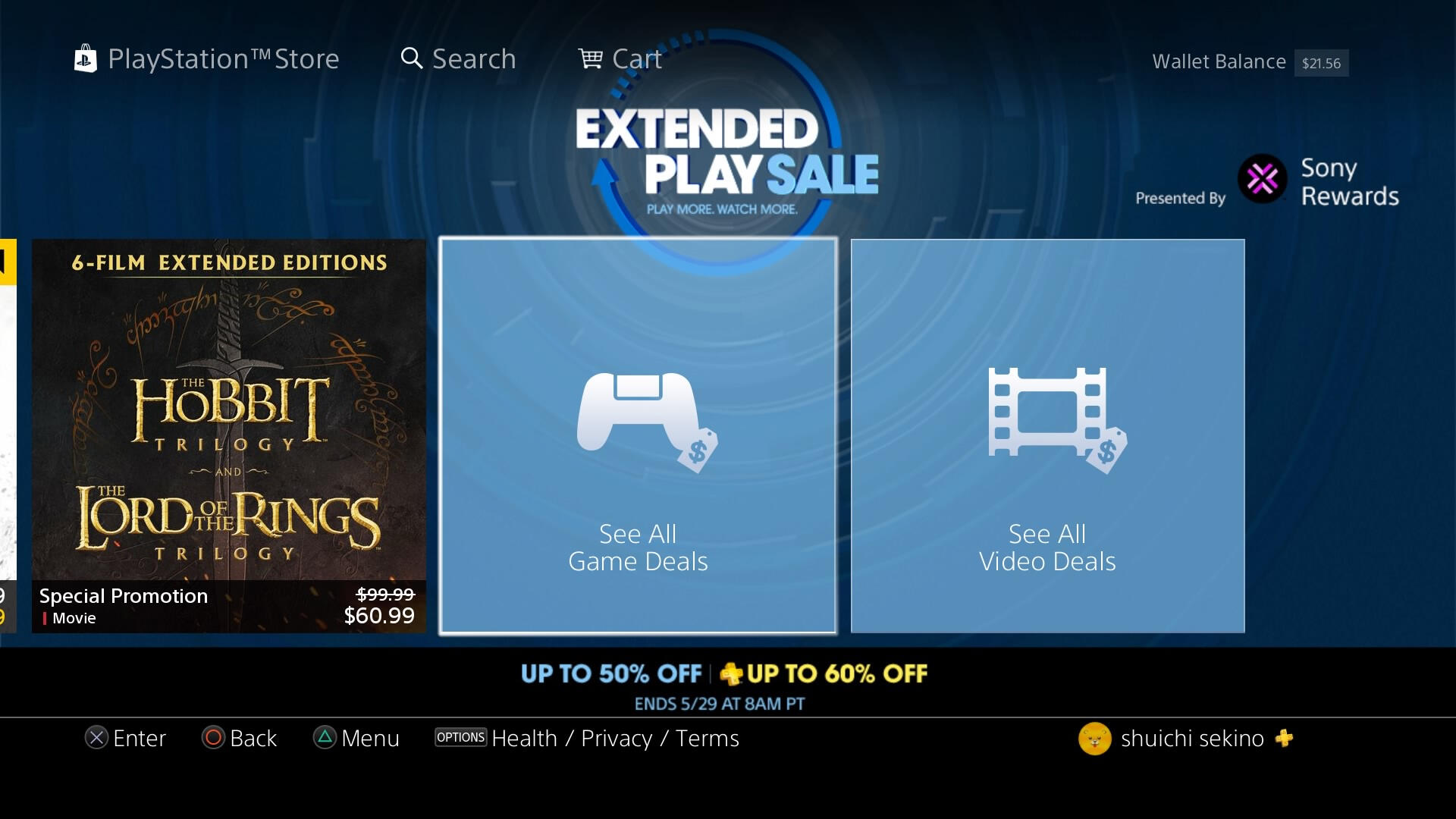
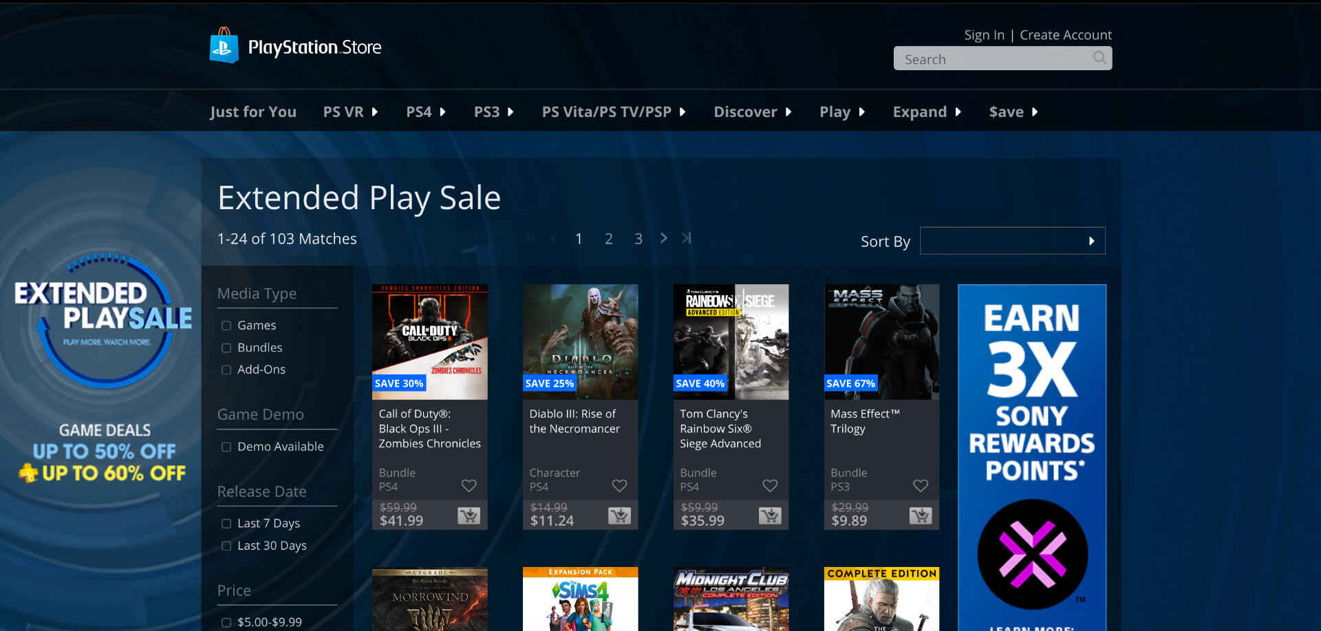
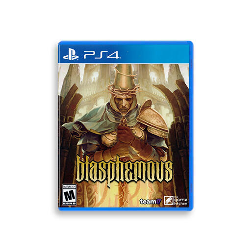
Generated promotional content for the PlayStation Store, published weekly on console, web and mobile platforms with over 80 million monthly active users.Working closely with Client Relations and Store Operations successfully identified opportunities to optimize workflows and ensure timely asset delivery. Designed promotional interactive spaces for various products and campaigns for video game titles, movies and TV shows from studios such as Electronic Arts, Ubisoft, Square Enix, Naughty Dog, HBO, Showtime, among many others.Following the re-design of the Playstation Music section of the PlayStation Store, I created efficient Photoshop templates for the team to utilize in creating weekly content. Testing them and gathering feedback to make improvements where applicable.During my time here, I was also part of a Latino Employee Resource Group called Círculo. I pitched and lead an event and activities to celebrate Día de Muertos on the PlayStation San Mateo Campus. The event had a great response from employees and raised over $3,000 dollars to support the Puerto Rico and Mexico City natural disasters of 2017.
| Skills | Software | Year |
|---|---|---|
| Mockups | Photoshop | 2017-2018 |
| Image Editing | Illustrator |
Origin.com
Summary
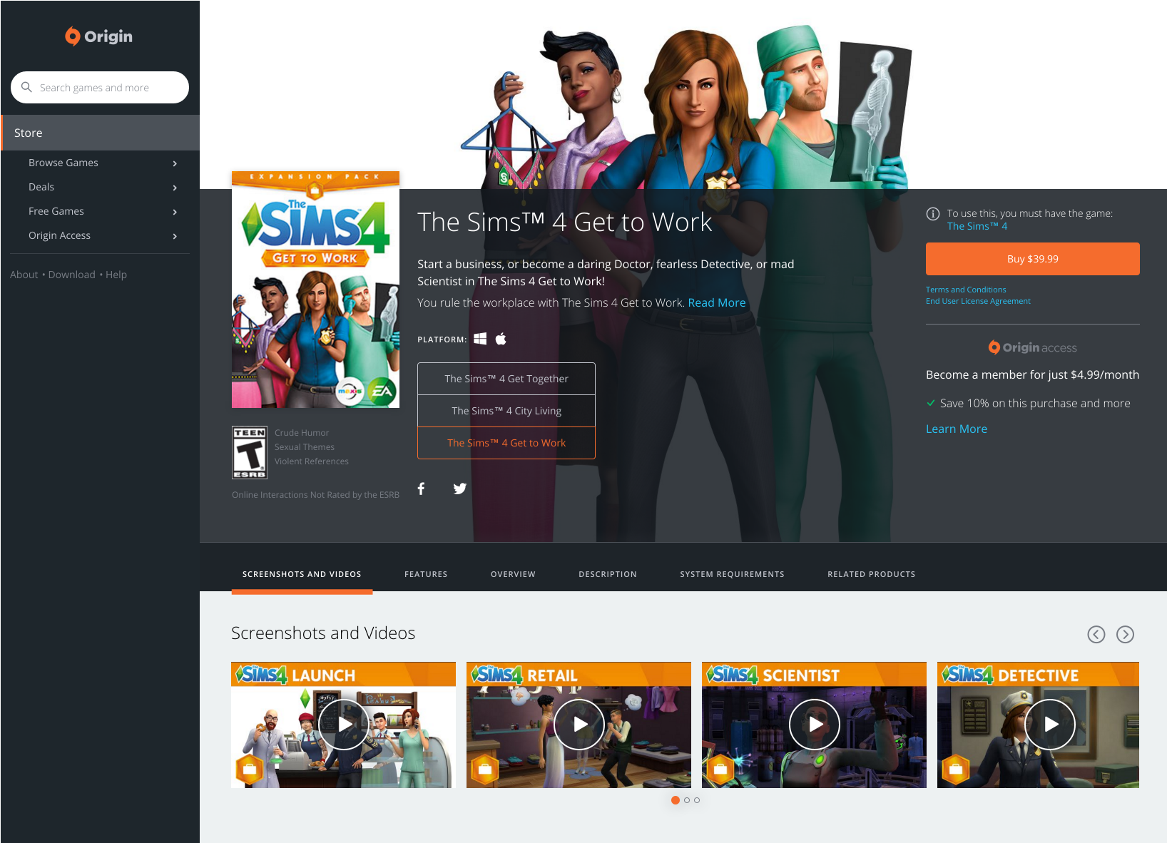
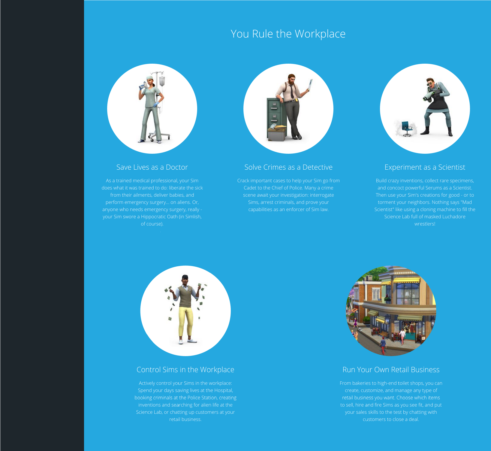
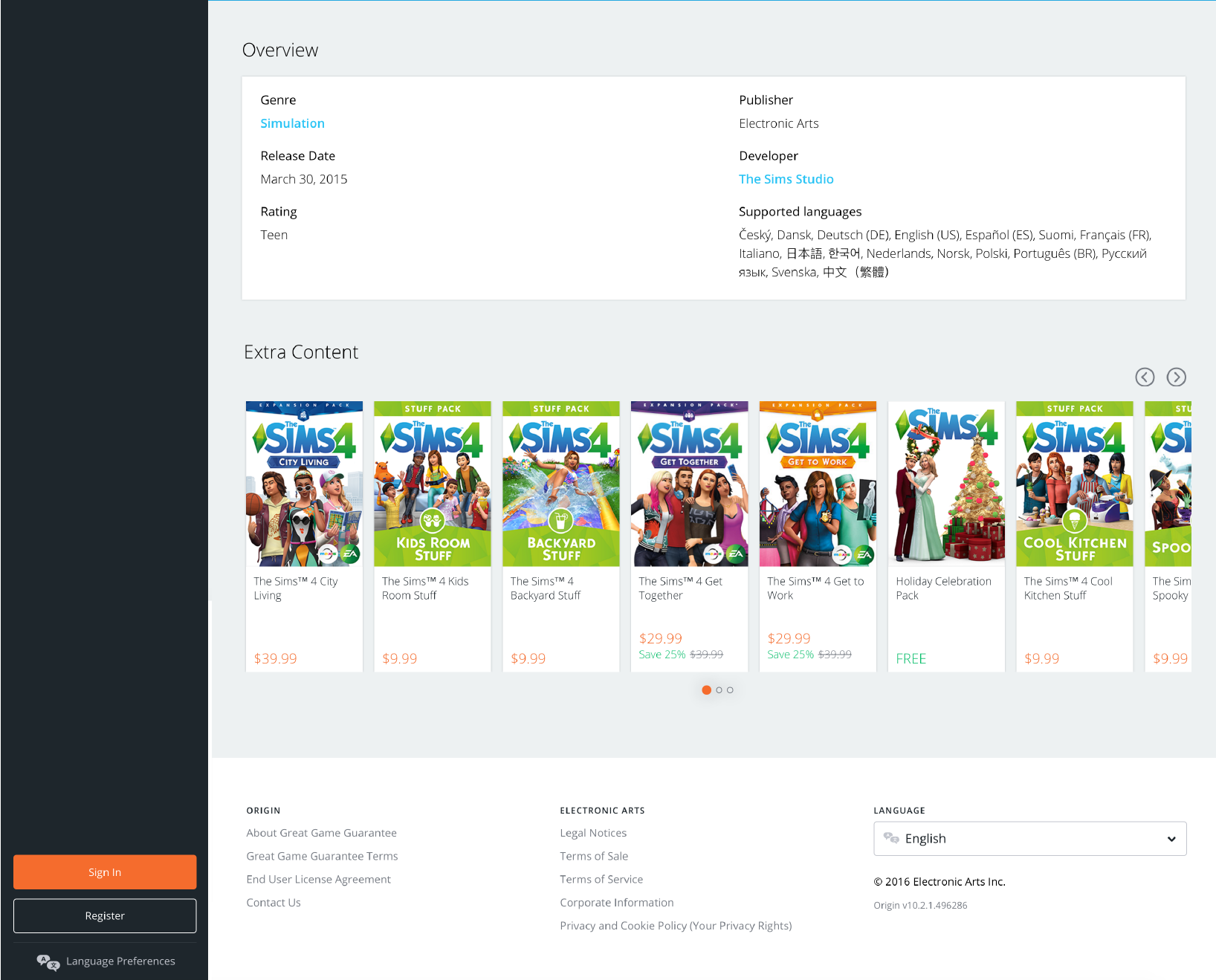
Working closely with the Art Director and following brand guidelines, I curated and edited graphics for over 100 video game product pages of titles such as The Sims 4, Plants vs Zombies Garden Warfare, Battlefield 1, among others, optimizing these for all platforms. Created high fidelity wireframes and mockups in Sketch and also edited code to preview the prototyped pages.
| Skills | Software | Year |
|---|---|---|
| Mockups | Sketch | 2016 |
| Image Editing | Photoshop |
Motion Samples
Interfaces
Microinteractions
AUGMENTED REALITY
Misc
| Skills | Software | Year |
|---|---|---|
| Motion Design | After Effects | 2021 |
UN Women Game Jam
PURPOSE AND CONTEXT
This was my first game jam! I joined with the purpose of learning more about the different roles in game development and how they work together. I also wanted to discover the ways I could apply my current skills in this setting.
OBJECTIVE
This game jam was hosted by UN Women (The United Nations Entity for Gender Equality and the Empowerment of Women). The purpose was to create a safe and inclusive space for women and underrepresented groups to learn more about game development and the ways in which we can all fight genre violence stereotypes in video games. Our theme was "Living in peace is.."
Our proposal
Our team consisted of 2 programmers, one sound designer, and three artists - including myself. After a 2 day discussion working on our game document, we landed on our premise: Do you feel safe walking alone at night?The game is played from a girl's perspective trying to make it back home safely.
This is something that resonated with the whole team and everyone had a story about.We decided to make our protagonist a participant in a women's rights protest to represent current events.
Working through the UI Details
Once we agreed on the general context of our game and how our protagonist wins, we jumped into defining the basic screens together in Google Jam Board.
Working through the UI Details
For the character's fight mechanic, I initially thought of having 1-2 basic actions like "Argue" and "Punch" as their own action keys, and a separate key to select an item, similar to RPGs.After discussing it with the programmers we decided to go for a simpler approach and assign a key to each item.To explain the mechanic of these to the player and reduce the cognitive load once the game starts, I decided to create weapon cards detailing each weapon and action key shown in the beginning, and, once the game starts, keep the icons visible on the screen with their corresponding key.From our list, 6 felt like the max we could show without overcrowding the screen.
PROGRESSION MAP
To reinforce the end goal and show the player how far they have left to go, I added a simple progression bar composed of icons representing the women's march (initial location), our protagonist's home (end location) and a pin with her current location.
ENEMY BARS
Enemies have different levels of difficulty. To represent this for the player, I used an enemy health bar. Depending on the enemy, some weapons were more effective than others. There were two ways we were thinking of showing this:One was to simply show less damage in the bar, but we decided to use a more informative one showing the health "points" for each enemy and subtracting them as the player does damage.At this point, the background and character art were still being developed. To determine the ideal size, I mocked our screen with a placeholder background that had the desired feel and a stick figure to determine positioning.
Time Countdown
To up the stakes in the game, we decided to add an element of time. Our protagonist wins when she makes it home within a set time frame.To show this, I added a countdown that would change color to red to warn the player when time is almost up.
Art Production
The artist creating the main characters sketched these by hand. I supported in color correcting the artwork and cutting, resizing to our scene and setting the characters up for animation.
Game Menu
Coming close to the end and not wanting to consume time left for the programmers, I decided to keep all menus and win/lose messaging very simple. My only extra request was to add some ambience to the initial home screen by adding a flickering effect to the lights in the background.
| Skills | Software | Year |
|---|---|---|
| Game UI/UX | Illustrator | 2020 |
| Image Editing | Photoshop | |
| Game Design | Google Jam Board |
CONTACT
Have a role or project you'd like to discuss? Get in touch below!
Also taking coffee, food and hiking recommendations in Orange County.
Share your best spots! (:
ABOUT ME
Currently, I'm a freelancer at XAMA Creative working on UX/UI and Interaction design for games streamers can play with their Twitch audience.Since a kid, I've been inspired by videogames and how different disciplines come together to create a memorable interactive experience.
I love learning skills that enrich my design process. Here is what I'm currently exploring:
- Participating in VR Game Jams
- 3D modeling in Blender
- Working with UI in Unity and Scripting in C#I’m proud of my Latino heritage and this reflects in my passionate and empathetic approach to solve any challenge.When not glued to a computer, you'll find me reading, playing video games, trying out new recipes and hiking around Orange County with my husband.
